November 14, 2022

I am consistently amazed at the immaturity of business analytics within early stage companies. I base this amazement on a few data points:
I receive a few startups investor updates
I talk to many other founders about their metrics
I am also sent a moderate amount of fundraising Journeys to review.
Now, there’s a big difference between the business analytics a startup operates with and the metrics a startup fundraises with — the latter is far less granular than the former — but you can often tell by looking at fundraising metrics just how thoughtful a founder is about business analytics in general, and of course if they’re including things like cumulative users you know the founder probably does not have the strongest analytics background.
More generally, when I talk to other founders and ask them how things are going, it's amazing how hand wavvy they are about their metrics. Are they hiding the truth or simply not sure?
Enter Business Analytics. The way to drive your startup.

Psst: Business analytics is unusual in that ridiculous "analytics clip art" perfectly describes business analytics. Please enjoy this rare ridiculous clip art on the Journey blog. (Please also enjoy the very obfuscated example charts posted later on!)
Business Analytics Granularity
To get started with business analytics you need to nail the granularity:
Your Amplitude conversion funnel is useful but too low level — especially given the relatively low volume of signups pre-PMF startups get, and that funnels can be influenced up the wazoo by “founder onboarding” of new users and such.
A Stripe revenue dashboard is useful but too high level — knowing that revenue is going up or down is great, but for pre-PMF startups, you often need to go more granular for this data to be truly actionable.
Being actionable is the crux of a good business analytics dashboard: business dashboards need to help you drive the business. You need to be able to look at it and have a 80% understanding of how the week is going with an 80% confidence.
If you do not have a clear dashboard you can load and understand how your week and/or month is going, you’re missing out big time — you're driving blind!
The 5 metrics you need
These are the five metrics that every single B2B startup needs to track on their business dashboard — period.
#0. Revenue
I actually do not think this metric is terribly valuable until you’ve got a repeatable sales model — but i’d be remiss to not include this, obviously.

#1. Northstar product engagement metric

In my experience this is the most important metric for pre-PMF startups — more so than revenue — the crux of this metric is:
→ Are people doing the thing I want people to do with my product?
For example at Journey, our north star metric is “how many organizations have shared a Journey” — we know that if this metric is going up, we’re not only seeing increased engagement generally, but that that engagement is directly tied to product happiness, and thus revenue.
Your north star metric should be tied directly to the user doing the thing that you want them to do with your product — when I worked at AdRoll, it was place the Javascript SmartPixel: we knew if you did that tedious work, you were well on the way to finding value with the product.

#2. Product engagement drill down
The second most important metric for pre-PMF startups is:
→ Are people doing the actions I need them to do to get them to the north star?
For example at Journey, we know that in order for you to share a Journey, you’ve first got to create a Journey.
We also know that existing users are far more likely to create a Journey than a new user — for the obvious reason that the former have already seen the delightful magical experience of sharing a Journey (seriously, try it!) and are therefore more likely to be a sticky user, than new users who are still figuring out WTF we do.
I think a good Northstar product engagement drill down (whew) metric would be the steps that happen after signup but before the northstar metric. In many ways, your northstar metric is a downstream metric — you do not directly influence it, but you influence metrics that feed it.
As such, I’d almost argue that the “Product engagement drill down” metric is almost more important than the actual northstar engagement metric, but this metric is often less digestable than the singular northstar metric, since its a funnel rather than a single number.
#3. Acquisition funnel
On a given day, week and month you should know:
How many organizations are signing up
How many users (belonging to existing organizations) are signing up
… and how this data is trending over time. A simple way of understanding this trend data is to simply show these data on a weekly basis, alongside historical weeks.
Just like with the second metric, this is a metric that fuels the north star metric. If new users are not signing up to your product, you’re probably not going to meaningfully grow your north star metric.
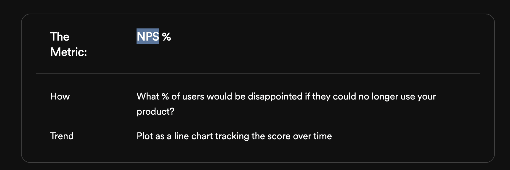
#4. Net Promoter Score

How many users would be disappointed if your product no longer existed?
Understanding this metric — as a percentage — is super useful! As has been written about extensively, you need this metric to be at least 40 and ideally closer to 75.
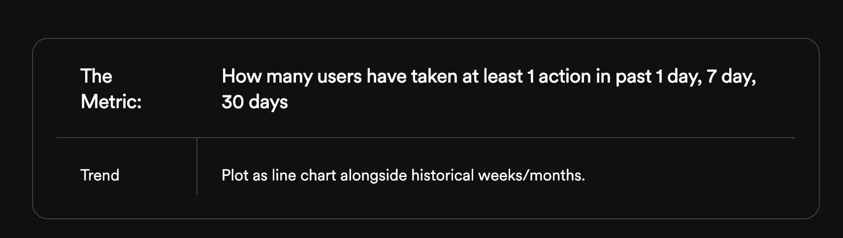
#5. Rolling Retention
Finally, you should keep a close eye on user retention. Retention is a beast to measure but its worth tracking the minimal metrics as quickly as you can. I would recommend simply tracking retention on a rolling 1 day, 7 day and 30 day basis — namely, how many unique users took at least one action in those time periods.
Things to remember
Never show cumulative data → it feels good seeing big numbers but is meaningless since cumulative data always goes up
Always show deltas and/or historical data alongside current data → it's critical to see how this week is going vs. last week or last month
Make sure the charts are digestable → don't go overboard. You need to understand how things are going by looking at these charts briefly.
Accurate is better than done is better than perfect → Styling, formatting, assumptions, can all be tweaked later — but it's hard to fix data accuracy! Get it right.
Leverage tools → Tools like Avenue or Mode can help a ton with this stuff!
Trust in SQL → Sometimes it's best to just hire an analyst to write some SQL than trusting tools like Amplitude...
Automate the reports → Make it a ritual to have this data in Slack so anyone can see it instantly
Discuss the data → Every week spend at least 1 minute discussing how these analytics look compared to previous weeks.